
Have you ever had a dream of bringing your fantastical stories to life through art?
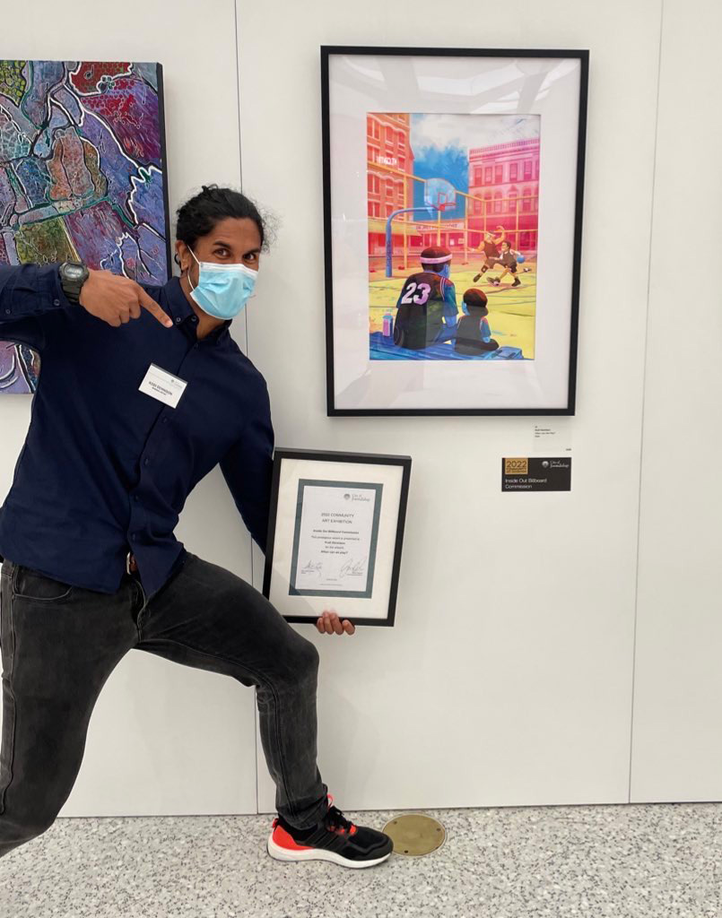
Well, for me, that dream came true when I was commissioned by the City of Joondalup to create a piece of art for their Inside Out billboard.
This was an incredible opportunity for me to combine two of my passions – art and storytelling, and the end result? A large piece of artwork that is now on display at the City of Joondalup Library.
But how did this all start? What is the meaning behind the artwork? And what is the process for creating such a piece?
In this article I’ll share with you the entire experience from how I got the opportunity in the first place, to the initial brainstorming sessions, ending with the final strokes of the digital brush. So, join me on this creative journey and discover how you too can turn your fantastical imaginings into a stunning work of art.
Receiving the Reward – How I got the commission in the first place
 Honestly I think I just got lucky…kinda.
So every year the City of Joondalup creates various art initiatives, to give artists in the area opportunities to showcase their works. The main event of which (at least to my knowledge) being the Joondalup Art Exhibition.
You know that exhibition they do in the middle of Joondalup shopping centre every year? Yeah, that exhibition. It’s a cool event that everyone gets to experience between March and April, so on their way to grabbing a Boost and a couple of bargains, shoppers can view works of art, all of which are up for sale.
What’s also great about the event, is any artist who is a resident of the COJ (City of Joondalup) can enter. Plus as part of their entry, they have the chance to win a couple of cool awards, which are as follows:
- Most Outstanding Artwork: $4,000
- Highly Commended Award: $1,500
- Artist in Focus Award: $3,000 and in-kind solo exhibition
- Celebrating Joondalup Award: $1,500
- Student Award: $750
- The Popular Choice Award: $500
- The Inside Out Billboard Commission: $3,000
Each award has its own specific criteria to win, the least of which being, you need to enter an art piece into the exhibition.
The artwork I entered into the 2022 exhibition is a piece I called “When can we play?”. It was a piece that was inspired by my experiences as a youth basketball coach and is one of the first pieces I did for myself that had some meaning to it beyond, I just want to make something that looks cool.
Prior to this piece, most if not all the art I did was either commission based for caricature work, or it was just me goofing off e.g posting on Instagram without any real purpose behind the art. Honestly, before this piece, I had never really sat down to create anything meaningful so in terms of my artistic development, it was a pivotal piece for me. Fortunately my artwork moved someone at the City of Joondalup to vote me as the winner of the 2022 Inside Out billboard commission. To say I was stoked is an understatement, and I’ll briefly explain why.
Just to paint a picture of what I was going through at the time, it was 2022 on the tail end of wearing masks and getting the jab. Saying farewell to a failed NFT collection that never saw the light of day, closing up shop on an online business I had been a part of since 2017, and tearing my hair out on a book I’ve been writing since 2012, which I’ve re-written more times than I’d like to admit.
In other words, it was not the best time for me, and having just turned 42, I was really doubting myself and my ability to make it as an artist. Something which I’ve wanted ever since I was a kid, watching Saturday morning cartoons in a pale and stuffy one bedroom apartment in Randwick all those years ago. Needless to say, receiving this award helped boost my confidence as an artist in a huge way. It finally felt like things were moving in the right direction, the dull sky was giving way to hope on the horizon, and suddenly everything felt possible. Life was good. That is until they asked me, “So Kodi, what are you going to paint for us?”
Oh crap.
Brainstorming the Idea – More storm than brain
One minute I was soaring like an eagle and then nekminnit I was tumbling like a turkey.
What was I supposed to create? What was I allowed to create? Am I even good enough to create a large 6m x 3m sized billboard art piece worth displaying on the Joondalup Libraries exterior? Who do I think I am thinking I could do this in the first place?
I was concerned, nervous, and afraid. I didn’t want to waste this opportunity nor make a fool of myself in the process. I needed an idea, but I couldn’t think of anything else except for the idea that has consumed my thoughts for the past few years. It was all I thought about when I had time to create, and truth be told it had become the only thing I wanted to create. I wanted this thing to be my inspiration for the artwork, but whether or not the COJ would allow me to base the commission off my idea, made me nervous.
So what is the idea? Well it’s not so much an idea as it is a story. The one I had been working on since 2012. I hadn’t been working on it full time since then, but lately I have committed more time to writing it. All my creative energy was going towards building the world, creating the characters and crafting the story. Writing this book has been a monstrous project to say the least, but it was all I thought about, and I wanted very much to create some art for it.
So on a Friday afternoon sitting on a soft and colourful couch inside Joondalup’s loaded Library, wearing our nurse masks and patchy COVID beards, I pitched my idea to Joondalup’s visual arts officer, Tim Carter with hope and a smile. I told him about my story, a fantasy tale set in the Kimberleys filled with art, animals and loads of magic. I presented it as well as I could, and despite the words tumbling out of my mouth, those disconnected words somehow landed perfectly into place, creating a vision in Tim’s mind that compelled him to give me the thumbs up, signed with the COVID handshake, aka, the fist bump.
What a relief. Now I just needed to figure out how to interpret my epic story of hundreds of thousands of words into a single epic image.
This shouldn’t be a problem at all. Right?
Sketching Squiggles – Painting the initial concepts
My favourite thing about creating anything is turning nothing into something.
To be able to stand back and say “I made this,” to me, is one of the coolest experiences in the world. There are so many lessons wrapped up in the process of producing a piece of art. Like patience, persistence and above all passion, for without which most things will never see the light of day. But above all you have something to show for the time and effort you put in.
So in an ideal world the process of art making begins with a clear vision. Something which I was struggling with at the time. I had too many ideas and I needed to filter them down or else suffer the consequence of too many fractions, and not enough action. I needed a concept that was clear, concise and that I could present in a month’s time – not the whole thing, but a rough sketch of what my plan was for the final piece. So to find it, I went for a walk.
My wife and I spent under an hour looking at the billboard space located outside the Joondalup Library, from various vantage points in the vicinity. From the furthest point to the closest, across the road and at the top of the library steps. From each point of view I took photos, so I could superimpose my sketches onto the photos and see if the concepts would work from those views. Seeing and taking photos of the billboard helped me to realise something important about producing a work of that size (6m x 3m). Despite its size, the billboard can be easy to miss because where it’s positioned on the libraries exterior, is not in a persons typical line of sight. It hangs high in the sky like a, well like a billboard. So the question for me was, ‘how do you grab a person’s attention so they are almost forced to look up at it? And how do you hold their interest there for more than just a glance? How do you help them to wonder?’
So after some thought and studying other large format works and murals online, I came to a few key conclusions that would help in achieving my main goal of grabbing a person’s attention.
The conclusions I came to are as follows:
- Eyes – As humans we are naturally drawn to look into a person’s eyes.
- Scale – Images that show a sense of scale, can communicate a feeling of awe and wonder.
- Contrast – Our eyes naturally move towards areas of high contrast. Placing two directly opposing things next to each other is quite powerful. Light and dark, bright and dull, big and small etc.
- Colour – Something I always struggle with because I want to use all the colours all the time, but you need to pick a palette and stick with it. A combo of a few colours can be easier to read, and thus more engaging.
- Something recognisable – Through my research I noticed that I was more drawn to works that represented something familiar to me personally.
- Interpretation – This is one of my favourite aspects of art. To leave things undefined so the viewer has space to be curious and make up their own mind on what’s going on.
Despite uncovering the importance of these elements of art and design, it was still a challenging process to include them into my sketches, while also attempting to illustrate moments of time from my story.
Regardless, here are the results.
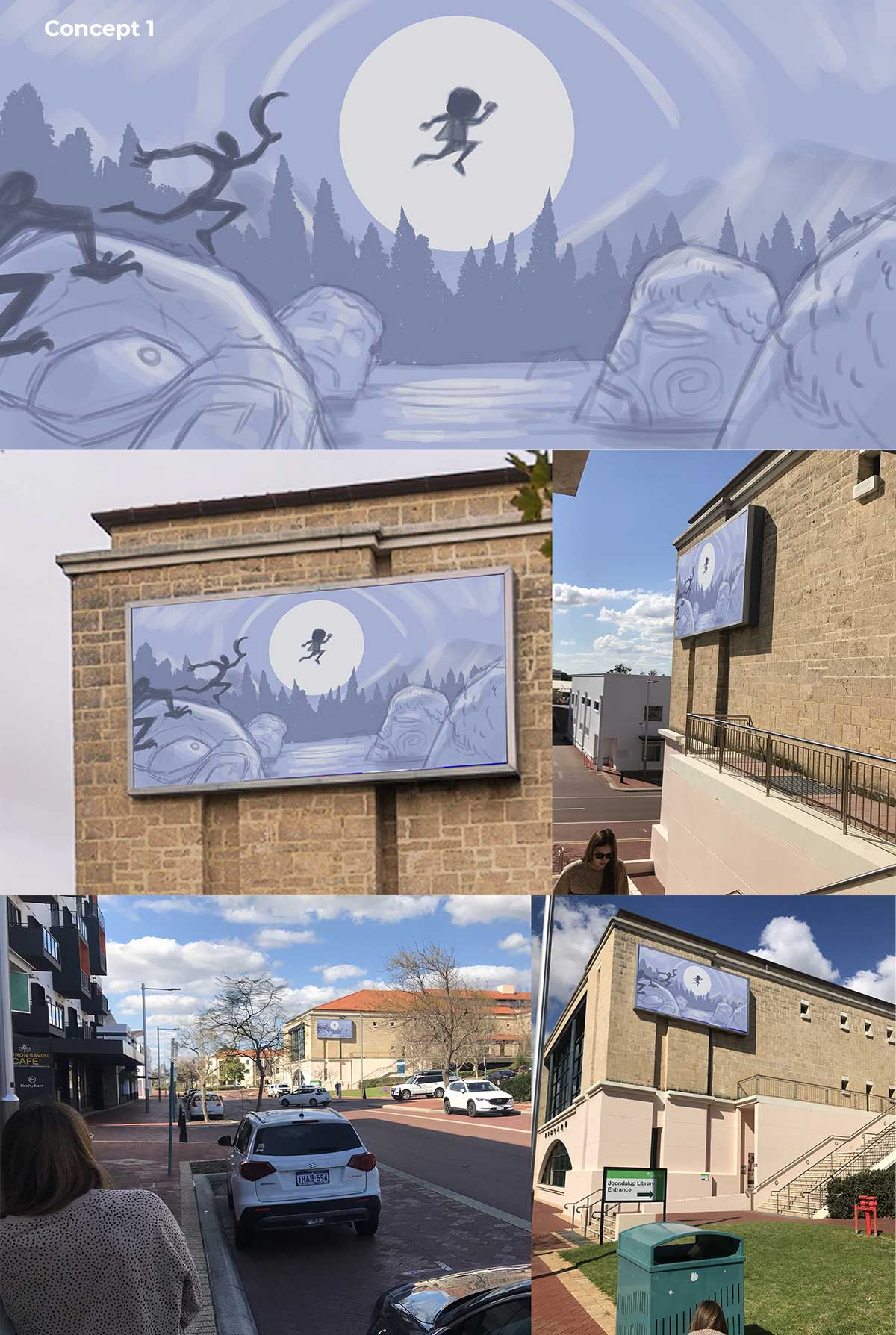
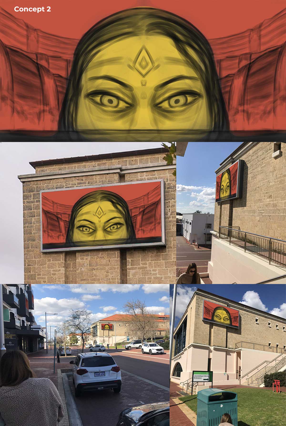


Fortunately by the time I got to the FIFTH sketch I felt confident this was going to be the idea I would go with. Looking at it made me feel good, and it ticked every box as far as the prior elements are concerned. But this work is a commissioned piece, so COJ will ultimately have the final say.
As fate would have it, we saw eye to eye on the concept, now onto the next part. Transforming it into its final form.
Painting Pixels – My not so pragmatic approach to painting
Turning a sketch into a final polished work of art is a journey filled with doubt and frustration, but in the end you always come out wiser for it, or so one would hope.
In the following sections I will share with you the process I took, how I changed it halfway (including the sketch itself) and the key learnings from the experience. But before we get into that…
Don’t Sweat the Software
Honestly it doesn’t matter what software you use to make your artwork, as I’ve used all of them and they all more or less work the same. They all have a layer stack, tools that simulate real world pencils and brushes, the ability to mask, adjustment layers etc etc. So whether you use Photoshop, Procreate, Painter or Clip Studio Paint, this process will work. If you are working traditionally this process will still work (with a few changes here and there), but the critical takeaway is to have some kind of process to get you there.
As far as what software I used for this piece, I used Clip Studio Paint on an iPad and Photoshop on the Macbook for final edits.
Now with that out of the way, let’s get into it.
Failing Forward – How not to start your artwork

I’m not new to digital art, I’ve been doing it for over 12 years, and in that time I have developed a process that works for me, which goes as follows (not always in this order):
- Creative concepts (already discussed)
- Sharpen the silhouettes
- Tune in the tone
- Shape with shadow
- Colour with consideration
- Finesse to final
It’s not the most artsy approach because you are dealing with each element of the artwork separate from the other. But the power of this process is that it allows you to quickly make edits to the shapes, colour and so forth. This allows you to go back and make changes without affecting the work you have done prior to that point. It gives you freedom to change your mind about things if you see an opportunity to make the work better. Which is exactly what happened with this piece, as you’ll see in a moment.
Back to the drawing board
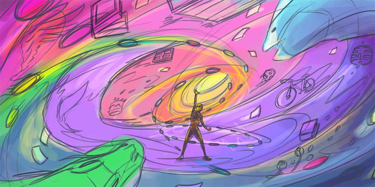
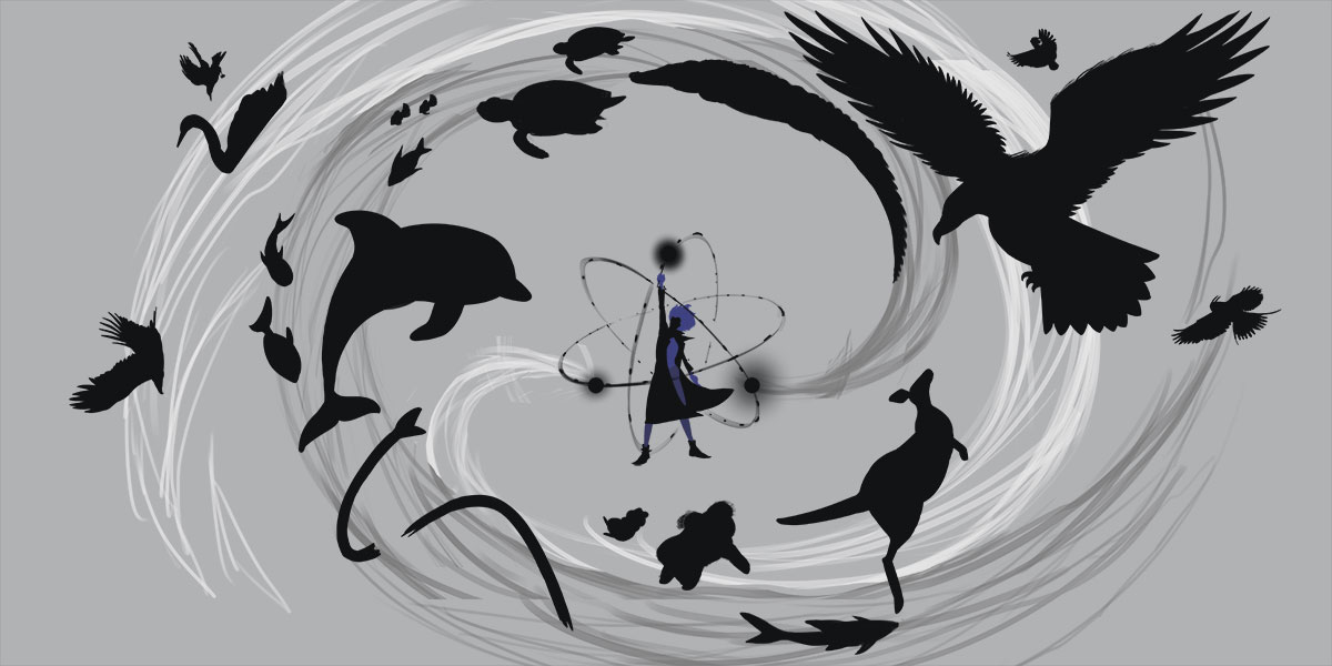
 Initially the idea was to have a bunch of random objects floating around the scene like books, because it was relevant to the library the artwork would end up on. A bike and whatever other object I could think of. However, in the example below you can see I ended up changing all the random shapes from the initial sketch into animals, which have a closer relationship to my book than the random images I squiggled into the initial sketch. Fortunately COJ were cool with this change but typically you want to stick with as much of the initial concept as you can.
As you can see in the below example, I was quite happy with the position of each of the animals and had already begun to apply the other steps to the work – tone, colour and shading. But as I was moving through these steps I began to feel less confident about the composition. Somehow it just didn’t feel right to me, so I did what any sensible artist would do. I went back to the drawing board and redrew the sketch.
Not an ideal choice to make but given the importance of the piece, I thought it was an essential choice to make for all the reasons. It would be on display in Joondalup for all to see, it was my first real piece of art related to my book and if nobody else liked the artwork, I knew at least one person would – me.
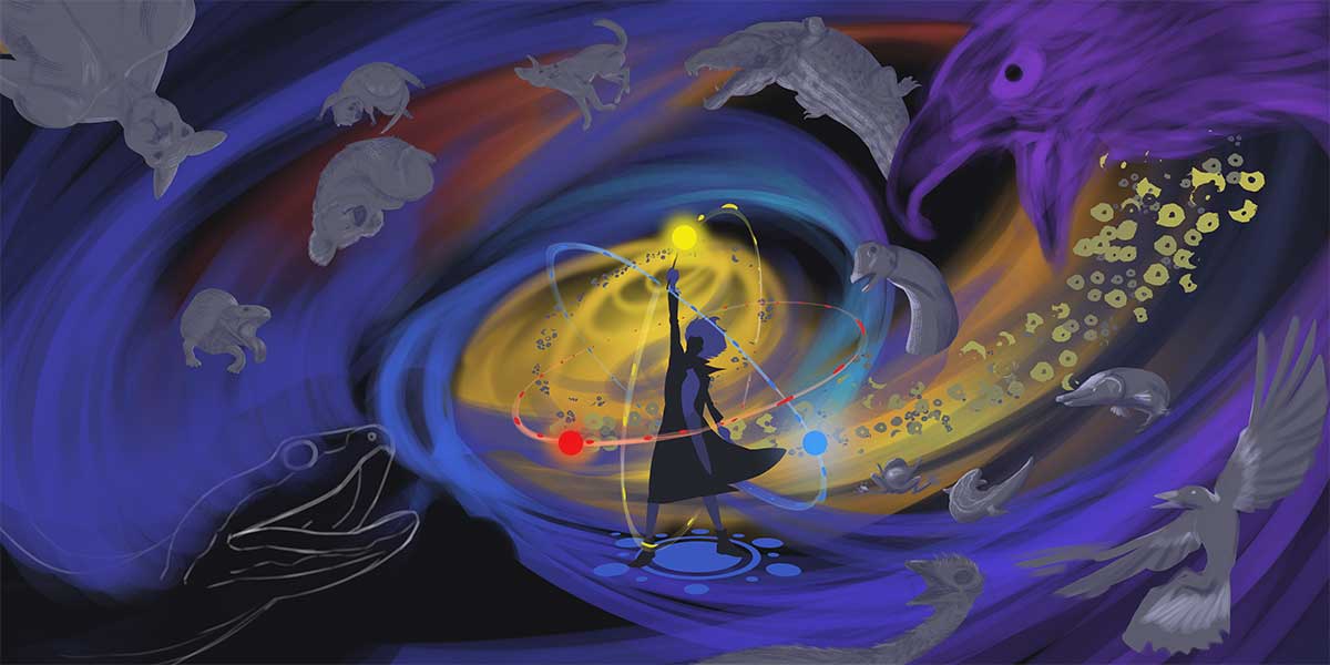
So my goal for the redesign was to maintain the concept of a vortex from which animals were being created out of, but to compose the image so it was a bit more uniform, so the animals had an even spread, and the flow of energy wasn’t so chaotic.
Once I was happy with the sketch and more importantly the composition, I then began the art process again.
Sharpen the silhouettes
Using the new sketch as my foundation, this process is about turning those scribbles into recognisable shapes so they are easy to read at a distance, which is critical given how far you can see the work from.
Basically what I’m doing here is looking at every object from a silhouette perspective and making sure you can see all the details one would expect to see of that shape. So a dolphin should look like a dolphin if you were only to see its silhouette, an eagle should look like an eagle as a silhouette etc.
To help make these shapes more readable, it’s also important to pose the shape in a way that makes it clear to the viewer what they are looking at and what that shape feels. For example the girl in the middle feels strong and powerful, which is evident by her pose. It’s better to communicate the emotions visually than for the girl to be slouched and seated saying, “I feel powerful.”
Tune in the tone
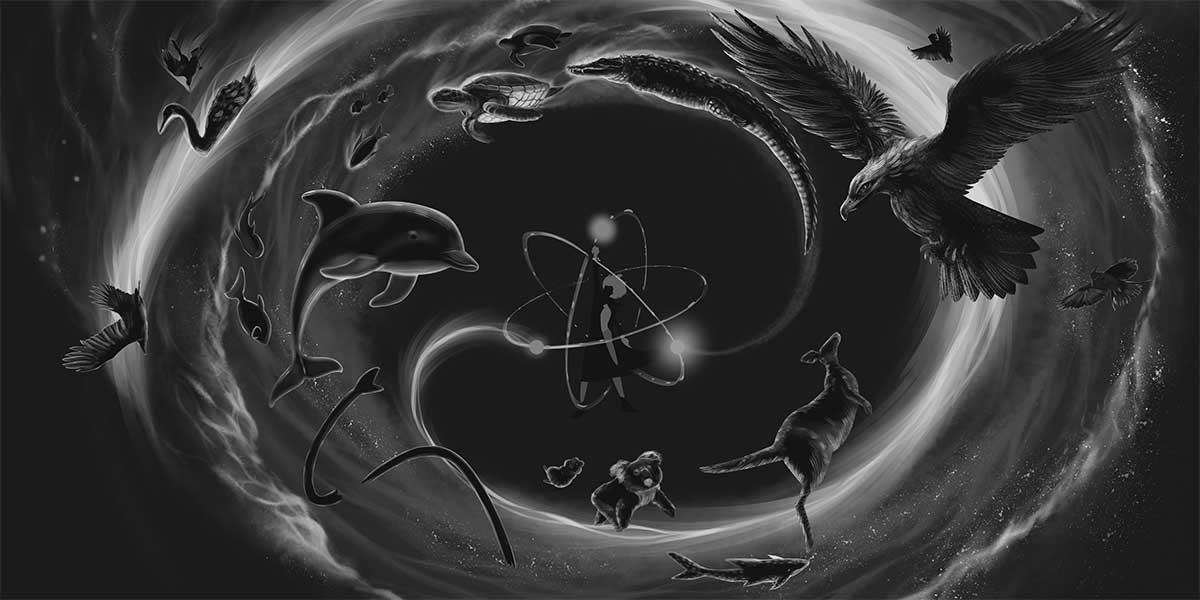
Tone in art deals with how light or dark something is. The reason why this is important is because it essentially defines the visual hierarchy of everything in your art. Is this object closer to the viewer or further away? Is this object the focal point of the work or not? All these questions can be answered using tone. In my piece I wanted the girl at the centre to stand out as well as have a clear flow of energy coming out from her that was brighter than the other flow of energy. This bright flow of energy would then give light to the animals being created by her. The artwork is dominated by darkness, but as long as there is hope, light will always show the way. Speaking of which…
Shaping with shadow
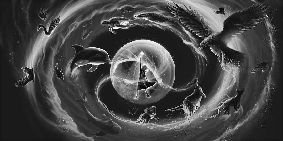
Now that we have applied tone on a picture wide level, we now apply it again but on an object level through the powers of light and dark. Focussing on each object in the work such as the girl, the dolphin, the eagle etc, I apply light and shadow which helps to give form to each object. The amount of light and shadow I apply depends on its proximity to the sources of light in the scene, the greatest of which being the girl, followed by one of the streams of energy pouring out of her.
This is a particularly fun process for me because it’s only at this step where I really get to see the artwork taking shape, as it progresses in a big way towards the final visual.
Colour with consideration
No colour is an island. Every colour you place in your work is changed by the colour you place next to it. Colours also come packed with meaning, giving the artist power to create thoughts and emotions beyond what they see before them.
In my initial sketch I presented a vision of an entire spectrum of colour, because my initial intent was to depict an explosion of creativity. However as I began to experiment with different colour combinations, I came to realise there was more power in reducing the palette. So I ended up landing on reds, yellows and blues as my palette for this piece, and I chose these colours because of their complementary benefits but also because it fit with what I was illustrating. Fire, water and turning the metaphysical into the physical.
Finesse to final

This is the last leg of a typically long process, and fortunately my favourite. This is the part where I turn everything up and make it sing. Those highlights become blinding, those rich reds get saturated with so much sugar it would make a sweet tooth sick. The colours harmonise like an angelic choir, as the harps of heaven fill your eyeballs with a glorious vision of joy.
Much of the hard work is done at this point so all I’m doing at this step is adding the last touches before I call it done. Adjusting levels, balancing colours, playing with the brightness and contrast etc. It’s very much like when you take a photo on your phone and you hit the edit button, and you play around with all those sliders until you find the right levels to turn the photo from good to great. That’s basically what I’m doing here, and it’s super fun and a great way to finish off a generally long process.
Conclusion

As I write this on the long train home from work in Fremantle to Alkimos, I feel grateful for the opportunity the City of Joondalup has given me to create this artwork. It gave me a boost in confidence that I never knew I needed. Not only did it give me the chance to create an art piece I wanted to be truly proud of, but it gave me an opportunity to create artwork for a story I have been working on for a very long time.
What this experience has taught me is you should always give things a go even if it seems unlikely you’ll get the result you’re hoping for. In the least you’ll learn something for doing so, and at best you could surprise yourself with getting exactly what you wanted. All you need is a bit of imagination and the willingness to try.
So if you’re interested in bringing your own creative visions to life, I encourage you to take the leap and give it a shot. Who knows what kind of magical worlds you’ll create!
If you are an artist reading this and have any other questions about my process or if you would like to know more about my story, please feel free to contact me using the form below or on instagram/kodisketches.
Thank you for your time and I wish you all the best.